-2.png?width=156&height=60&name=Hawkin%20Logo%20(2)-2.png)

Interpreting a Quadrant Chart:
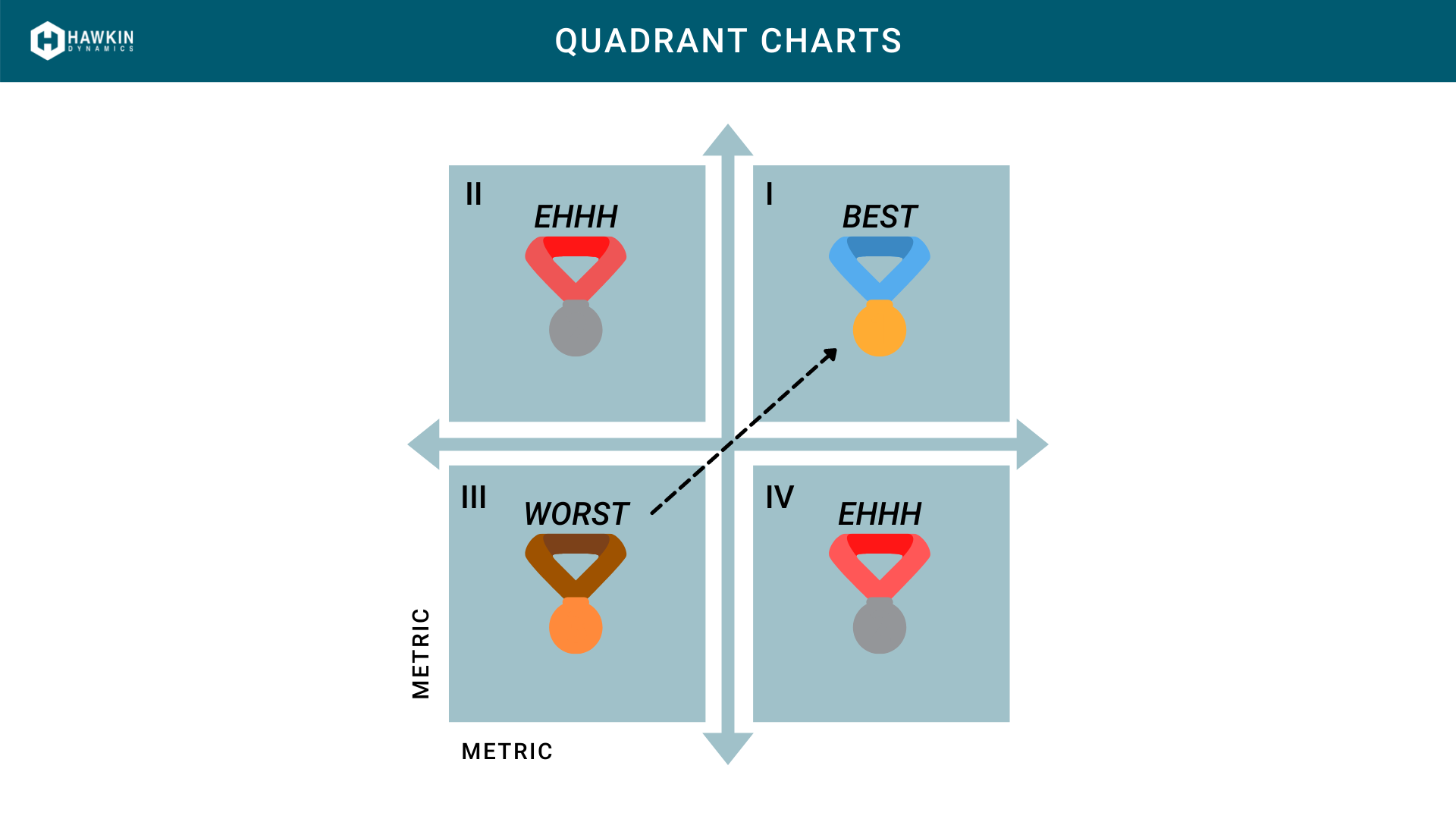
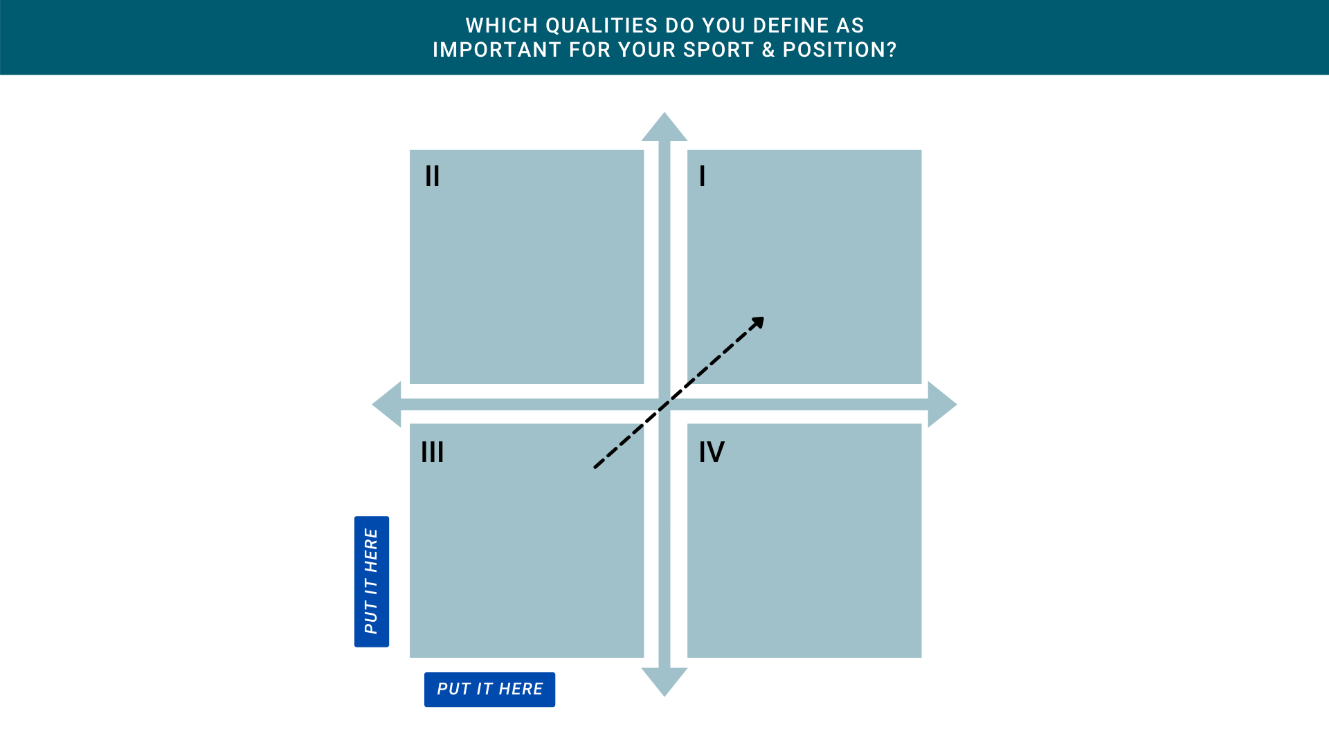
Figure 1: The figure above illustrates a blank quadrant chart. A quadrant chart is essentially a scatter plot, with the background split into four equal sections (quadrants). The purpose of a quadrant chart is to group athletes into four distinct categories based on the defined criteria. The two metrics on the x-axis (horizontal) and y-axis (vertical) are the criteria.
When selecting criteria, it is important to consider the sport that you are profiling and also the physical attributes that allow someone to excel in that sport. When determining physical attributes, think about the different abilities between the best athlete in that position vs. the worst. For example, when comparing running backs on a football team a quality that would separate two individuals is the ability to change direction and make quick cuts to avoid defenders. Therefore, a metric that would make sense to include in the criteria would be one that helps explain an individual's ability to decelerate. During the braking phase, we know that the athlete is decelerating their center of mass because if they did not apply force and decelerate their center of mass they would fall through the floor.
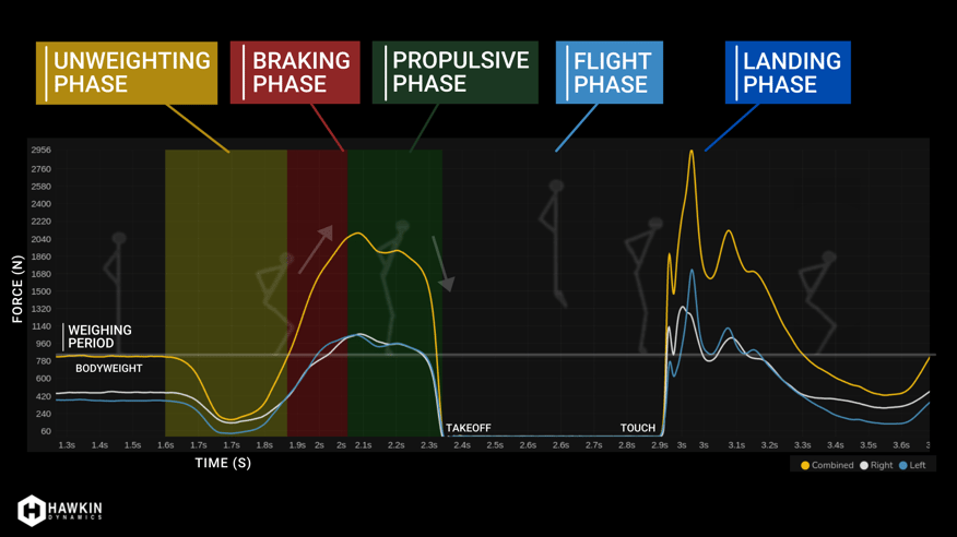
Figure 2: The lowest position of the countermovement jump occurs between the red (braking) and green (propulsive) phases. This brief period of time can be thought of as the amortization period when the athlete transfers direction. A very efficient jumper will be able to quickly reach the low position and propel themselves off the force plates. On the force-time curve, this will reflect itself by showing peak force occurring at or near this transfer point, and an abrupt drop-off of force after.
Common Metric Pairs for Quadrant Reports
There are common metric selections that you can pair together to create criteria for profiling athletes within a quadrant chart. Below I've compiled a list of four options that I think will work for most users. Sticking with the American Football theme, I have also included positions that I would include in each report.
1 Modified Reactive Strength Index
-
Jump Height (X), Time To Takeoff (Y)
-
Position Example: Wide Receiver, Defensive Back
2 Mass as an Asset (video by Dr. John McMahon)
-
Jump Momentum (X), System Weight (Y)
-
Position Example: Offensive Line, Defensive Line
3 Mass as an Asset, with Braking Element
-
Jump Momentum (X), Braking Net Impulse (Y), or
-
Jump Momentum (X), Relative Braking Net Impulse (Y)
-
Position Example: Running Back, Outside Linebacker
4 PRPP & Explosiveness
-
Peak Relative Propulsive Power (X), mRSI (Y)
-
Position Example: All positions
Just want to use one option for the entire team?
For those looking to keep simple, I would opt to use the Modified Reactive Strength Index Quadrant Report. This report is easy to understand, has ample research behind the mRSI metric, and also takes into account output (Jump height) and a strategy element (Jump time).
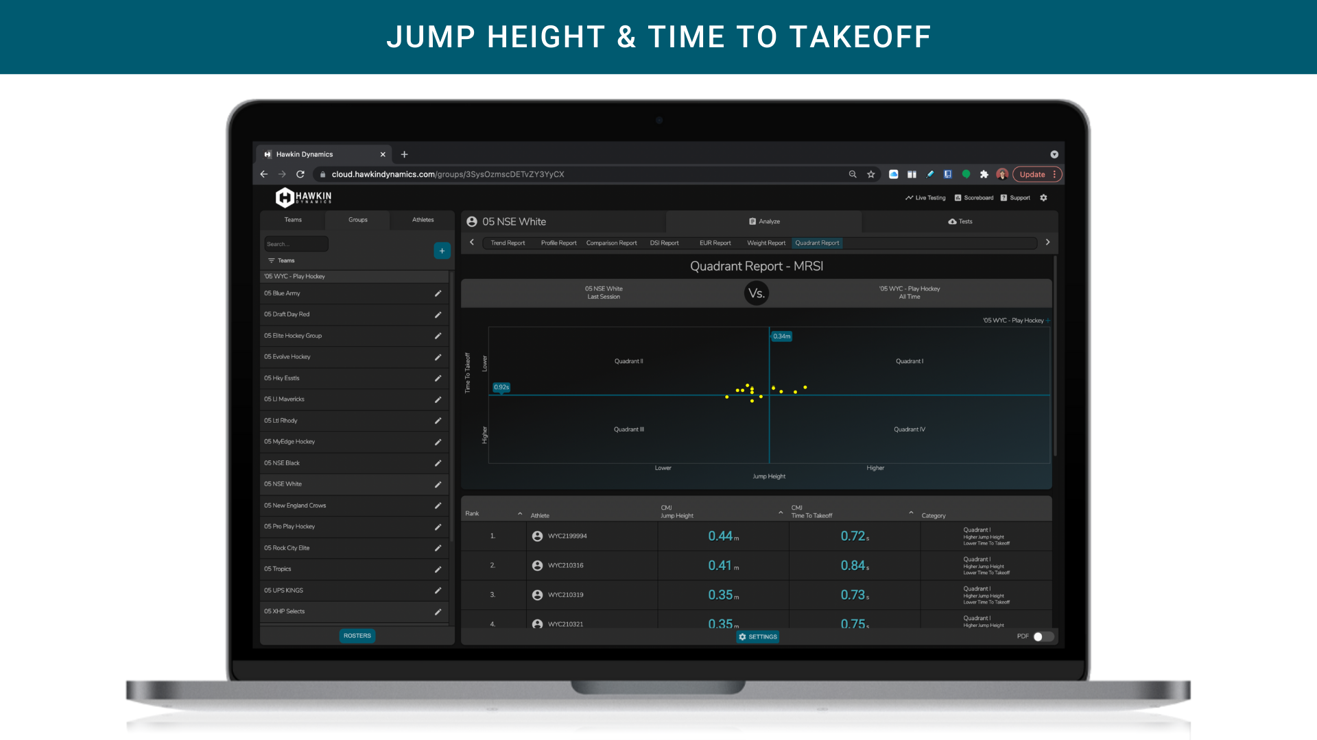
Figure 3: Example mRSI Quadrant Report with Jump Height on the X-axis and Time To Takeoff on the Y-Axis. In the HD System, Jump Height is calculated from Takeoff Velocity.
Setting Up Your Quadrant Report
The setup of the quadrant reports is just as important as the interpretation. Here is a video showing exactly how to setup the quadrant report in the HD Cloud App.
What should you use as the mean?
You have two options here. You can make the mean that of a team (i.e. Hawkin First Team) or that of a specific group (i.e. Hawkin Forwards). For users that do not have a lot of data, I suggest making the mean that of the team. If you are a user that has able data, then it would be best to make the group the mean so that you can compare athletes of similar type (i.e. position, age, etc.)
*Note that groups are different than position labels, and groups only work from the day forward - meaning it is pivotal you add new athletes to the correct group and adjust groups accordingly as athletes move in and out.
What date range should you select?
For new users with limited data, select "All-Time" as the date range. For users with lots of data, narrow in the date range to that of the off-season, in-season, or specific blocks within each that you expect to see a training effect.
Interpreting a Quadrant Report
After you have determined which metrics makes sense to include for both the sport & position, it is now time to interpret the chart. Very generally, the individuals that fall into Quadrant I (upper right) will be your best athletes. These are the ones that fit your metric criteria the best, whereas those in Quadrant III (bottom left) will be your worst athletes for the selected criteria. Quadrant II becomes athletes that are low in one metric, and high in the other, whereas Quadrant IV is the opposite of Quadrant II. An example of this is shown below under "Bucketing Athletes".
-
Quadrant I - STUDS
-
Quadrant II - depends on criteria
-
Quadrant III - DUDS
-
Quadrant IV - depends on criteria
Bucketing Athletes (refer to mRSI example above in Figure 3)
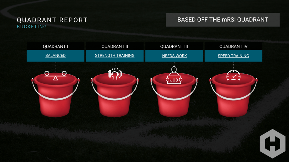
A quadrant report essentially provides the framework for a coach to bucket athletes in four different ways. Using the Modified Reactive Strength Index quadrant report as an example below:
-
Quadrant I - Stud. Our best athletes for this criteria. "Is there a quality that will help make them better in sport."
-
Quadrant II - Jump fast, but not very high (i.e. needs more strength-based training)
-
Quadrant III - Duds. It could be new untrained athletes coming into the system. They could also suck. They need to work on both.
-
Quadrant IV - Jumps high, but not very fast (i.e. needs more speed-based training)
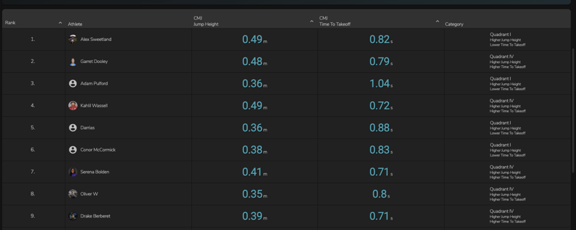 The image above is provided in the Hawkin Cloud App under Quadrant Reports > displayed below the Quadrant Chart. Each athlete is ranked and assigned a category (column 5). Athletes that fall into Quadrant I will be towards the top. The best athlete (ranked 1) will fall into Quadrant I and be the closest to the top right corner,
After Identifying a Weak Athlete, Now What?
Now that you have identified each athlete and placed them into four quadrants you can begin to think about different ways of training. The four quadrants as outlined above, now become four different ways to train. ("Buckets")
For those who want to get into more detail, a quadrant report provides the first layer. For example, we have bucketed our entire team and found that Kahil falls into Quadrant IV for the mRSI Quadrant Report. At the surface level, we know that he needs to work on speed-based training to bring him more in line with his peers, and hopefully provide him with the necessary qualities for his sport. Once identified, we can go into the "Tests" tab and find Kahil's tests to see why.
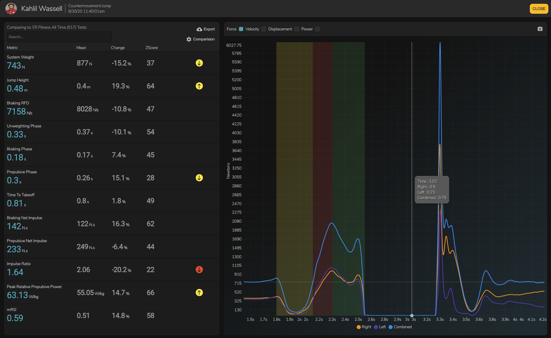
Clicking on Kahil's most recent Countermovement Jump (Hands on Hips) we see that he is low in specific metrics. The arrows and colors (i.e. red, yellow, green) highlight where Kahil is at in relation to the comparison population & date range. These are adjusted by clicking the wheel icon underneath export. The image below is comparing Kahil to the group "ER Fitness" and a date range set at all-time. Another common group that you might compare to is a position group (i.e. sprinters) and a specific period of time (i.e. early off-season training block).
The arrows and colors easily allow you to see where he stands. Yellow indicates that the athlete is between 1-2 Standard Deviations away, whereas red indicates over 2 Standard Deviations. The page also gives you a modified z-score to show you how far away from the mean he lies. For modified z-scores 100 would be the highest value, 50 would be the mean, and 0 would be the worst in the system for the selected population. This provides us with a deeper layer of feedback to train Kahil in relation to his peers.
The final layer that we can use to profile Kahil is the shape of his CMJ (Hands on Hips) force-time curve. Shape can tell you quite a bit about a jumper's ability. I'm going to leave this section blank and leave my analysis for our #HawkinFamily users who would like an additional level of support. If you are in search of more education regarding shape, metrics, and how you can use both to profile athletes - reach out to Drake at drake@hawkindynamics.com.