-2.png?width=156&height=60&name=Hawkin%20Logo%20(2)-2.png)

Hawkin Scoreboard 2.0 is here, and it changes what's possible on your testing display
The Hawkin Cloud Scoreboard has always done one thing well: put your force data on a big screen in real time. What it couldn't do was make that screen feel like yours.
With Hawkin Scoreboard 2.0, that changes. Your branding, your layout, your metrics, your presets — and for the first time, your force-time curves on any display in the room.
Here's what's new, and how to get it set up.
A display that looks like it belongs to you
The most immediate change is visual. Scoreboard 2.0 includes a full appearance system — not just a logo slot, but a complete set of controls for how the display looks.
In the Appearance tab of Settings, you can set your primary and secondary brand colours, choose between a solid or gradient background, unlock an Extended Palette for granular control over header, banner, card, and text colours, pick from 12 font families, set the title text to anything you want, and upload your organisation's logo.
For pro clubs and national programs, this means the screen on the gym wall looks like your gym wall. For universities running a testing practical, it means the display in the lab carries your institution's identity. For event organisers, it means the scoreboard at your combine or showcase is yours from the moment it loads.

Set it up once, save it as a preset, and it loads instantly every time.
Up to five metrics, rotating automatically
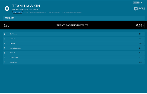
The original Scoreboard displayed one metric. You picked it before the session, and that was what athletes saw for the duration.
Scoreboard 2.0 lets you select up to five metrics and cycle through them automatically. Choose your rotation speed — 5, 10, 15, 30, or 60 seconds per metric — or set it to Manual and use the tabs at the top of the display to switch whenever you want.
Metric 1 (Primary) is used for ranking. When the carousel rotates to Metric 2 or beyond, athletes are re-ranked by that metric in real time.
For a strength and conditioning team running a CMJ battery, this might mean cycling through Jump Height, Peak Relative Power, Countermovement Depth, and Asymmetry Index across a single session — without anyone touching a screen.
Split screen: up to five columns, each independently configured
This is the layout change that opens the most tactical possibilities.
Under Split Scoreboard By in the Data tab, you can split the display into 2, 3, 4, or 5 independent columns — each showing a different team or group, with its own filters for Group and Tags.
A few ways teams are using this:
-
Attack vs defence — two columns, live during a squad CMJ session
-
Starters vs bench — same test, same day, instant comparison
-
Multiple cohorts — four position groups on one screen during a combine
-
Age groups — U18 on the left, senior squad on the right
The test type and metrics apply globally, so both sides of the screen are always comparing apples to apples.

Confetti when a new leader hits
Small feature, outsized effect in the room.
Enable Confetti on New #1 in the Appearance tab, and the display fires a confetti animation the moment an athlete takes the session top spot. It's off by default — turn it on for group testing days, combines, or any session where a bit of competition is welcome.
Force Trace: live force-time curves on any screen
This one is genuinely new — nothing like it existed in the previous version.
Hit the Force Trace button in the top-right corner of any scoreboard, and a full-screen view opens showing the force-time curve of the most recently completed test. Left plate, right plate, and combined traces. Phase bands. Athlete name, group, current rank, and metric score in a header bar.
It's built to go on a second display — a projector, pitch-side screen, or lecture hall monitor. There's no additional hardware required beyond a standard HDMI or DisplayPort connection to any screen you already have.
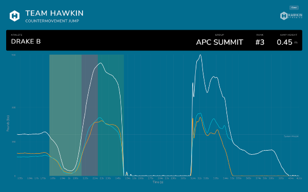
For coaches: the moment an athlete steps off the plate, their trace is on the big screen. Left versus right. Every phase. Immediately.
For academics: run a biomechanics practical and project every student's force-time curve in real time. The curve for each rep appears within seconds of completion, visible to the entire room — no app, no switching between tools.
Presets: your full configuration, saved by name
Every setting across the Data and Appearance tabs — team filters, metrics, layout, colours, branding, toggles, everything — can be saved together as a named preset.
Give it a name that reflects the context: 'Match Day CMJ', 'Rehab Monitoring', 'Combine Event Branded', 'CMJ Teaching View'. Next time you open the Scoreboard for that session, load the preset, and everything is exactly as you left it.

Teams managing multiple testing contexts across the week. This removes setup friction entirely.
Getting started
Everything in Scoreboard 2.0 is available to all Hawkin Cloud users now, at no additional cost.
-
Log in at cloud.hawkindynamics.com
-
Navigate to Scoreboard
-
Click the settings gear icon to open the new settings panel
-
Work through the Data and Appearance tabs, then save your configuration as a preset
For a step-by-step guide covering every setting and option, see the Scoreboard 2.0 Setup Guide.
Questions? Reach us at techsupport@hawkindynamics.com
Hawkin Dynamics builds the world's most accurate wireless force plates. Scoreboard 2.0 is available in Hawkin Cloud — the platform that turns your force data into decisions.